
Project Summary
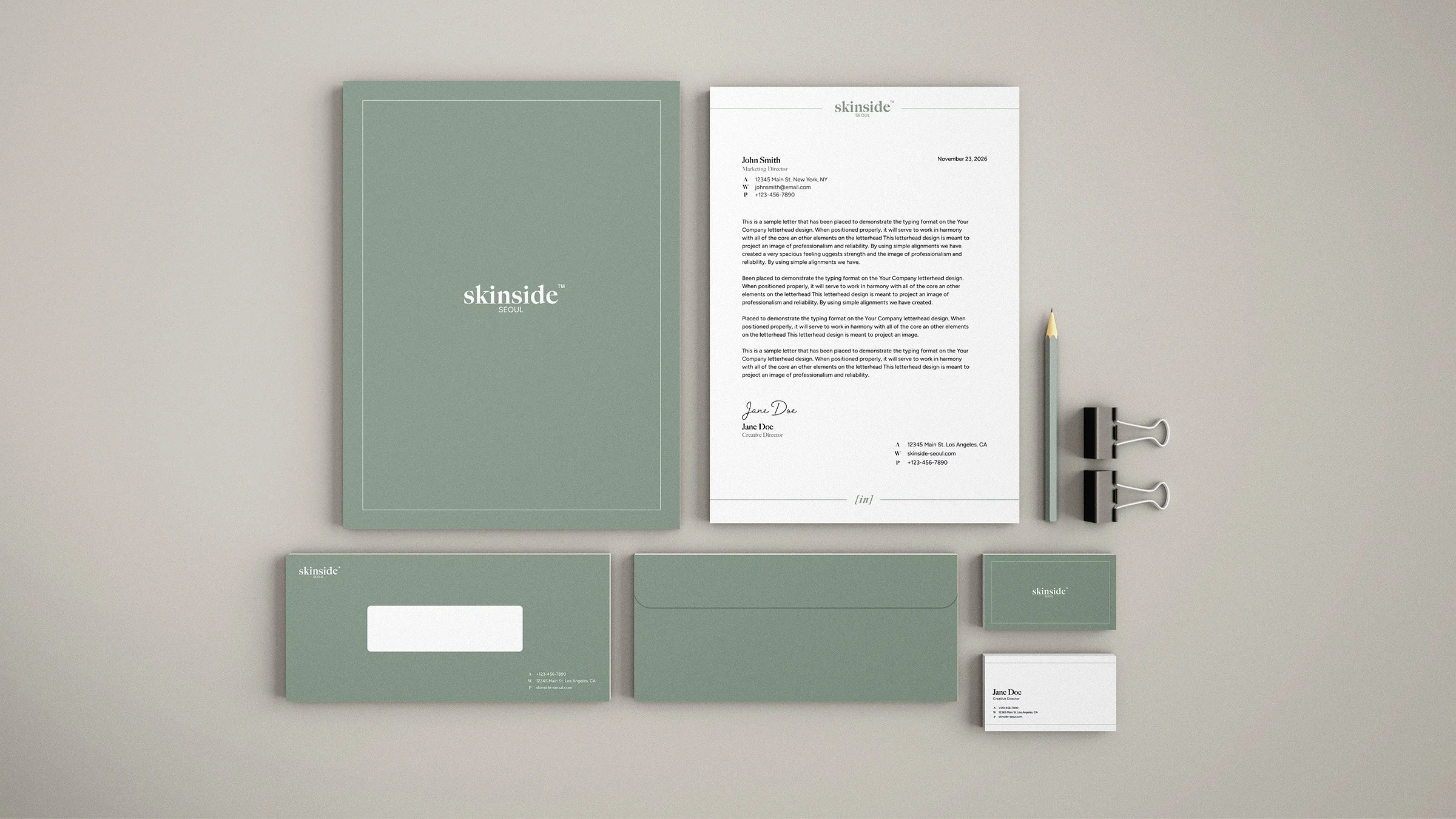
Skinside SEOUL is a Korean skincare brand for skin-conscious consumers in their mid-20s to 30s. This project explores a cohesive visual identity across packaging, PR materials, email, and brand applications.
Research
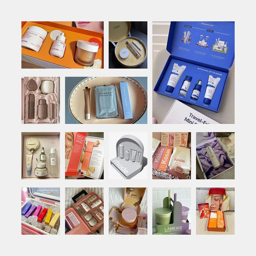
I researched packaging from Korean and US beauty brands for inspiration, focusing on unique packaging shapes, materials, compositions, and unboxing experiences.
Sketches
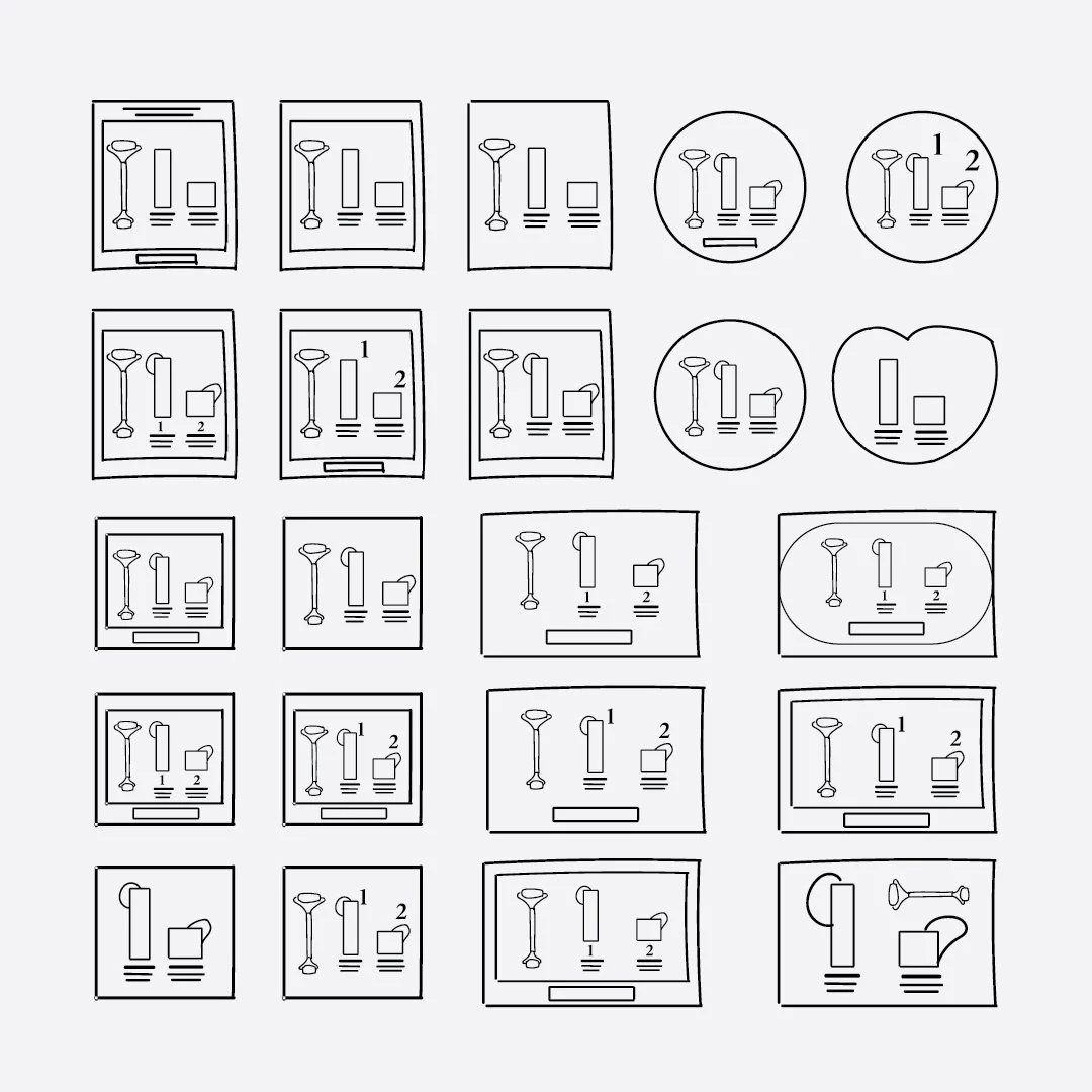
Next, I sketched different box sizes, shapes, product placements, and compositions to explore a range of possible directions.
Drafts
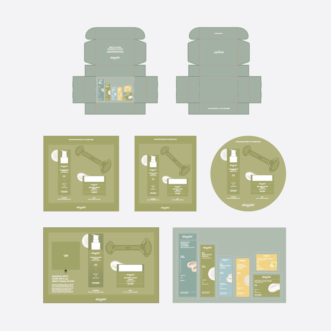
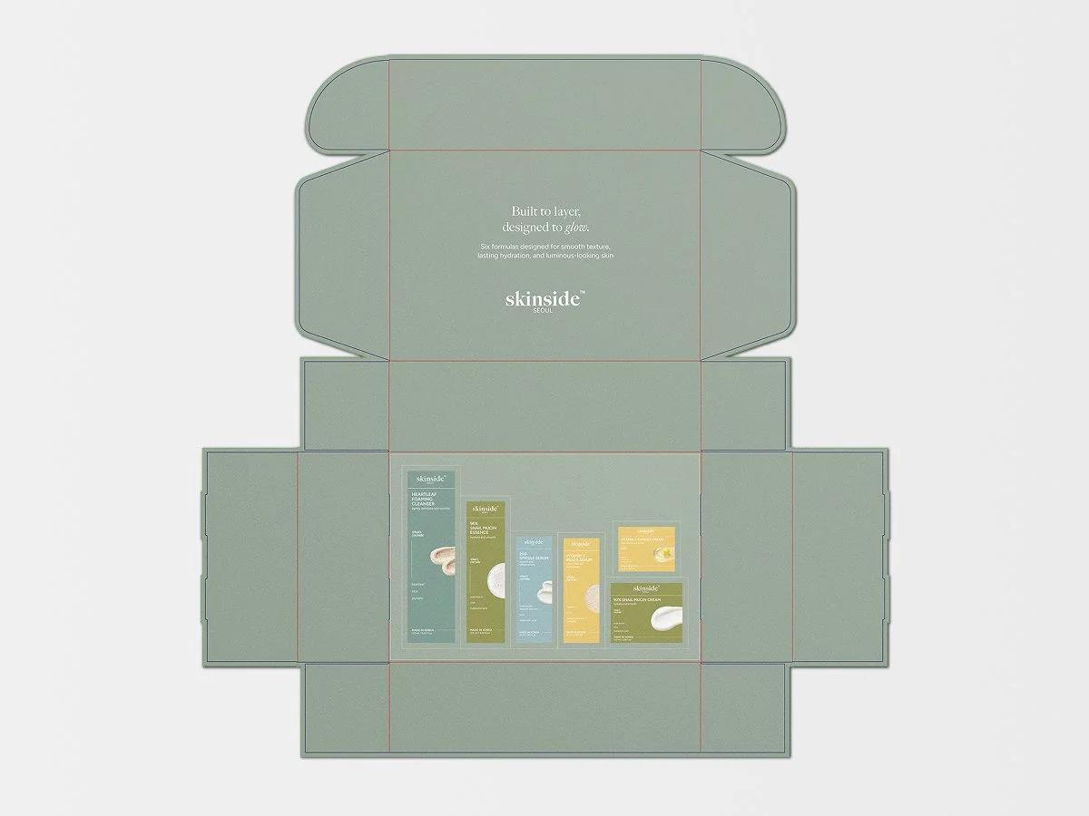
I selected the strongest concepts and developed them to scale in Illustrator using brand colors, typography, and design elements. After team feedback, I refined the selected direction.
PR Design
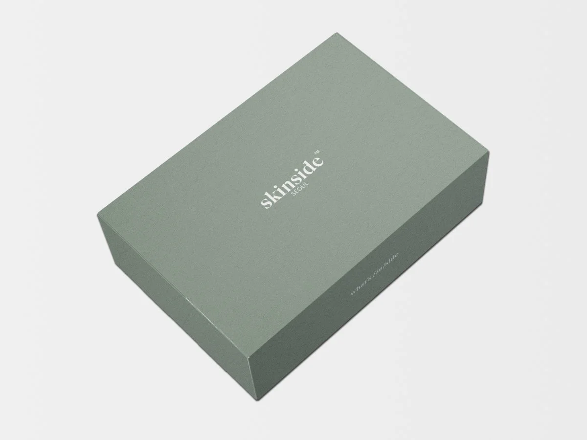
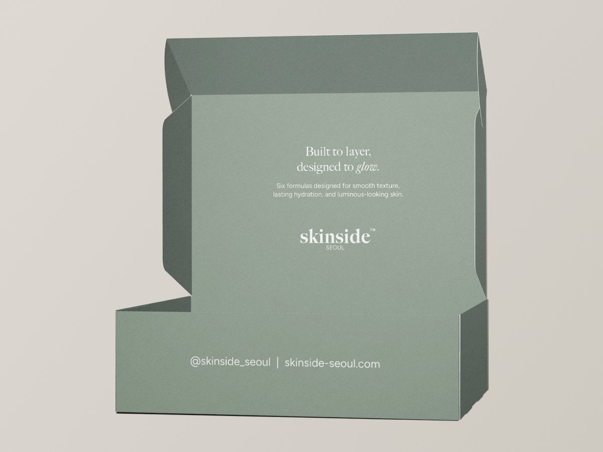
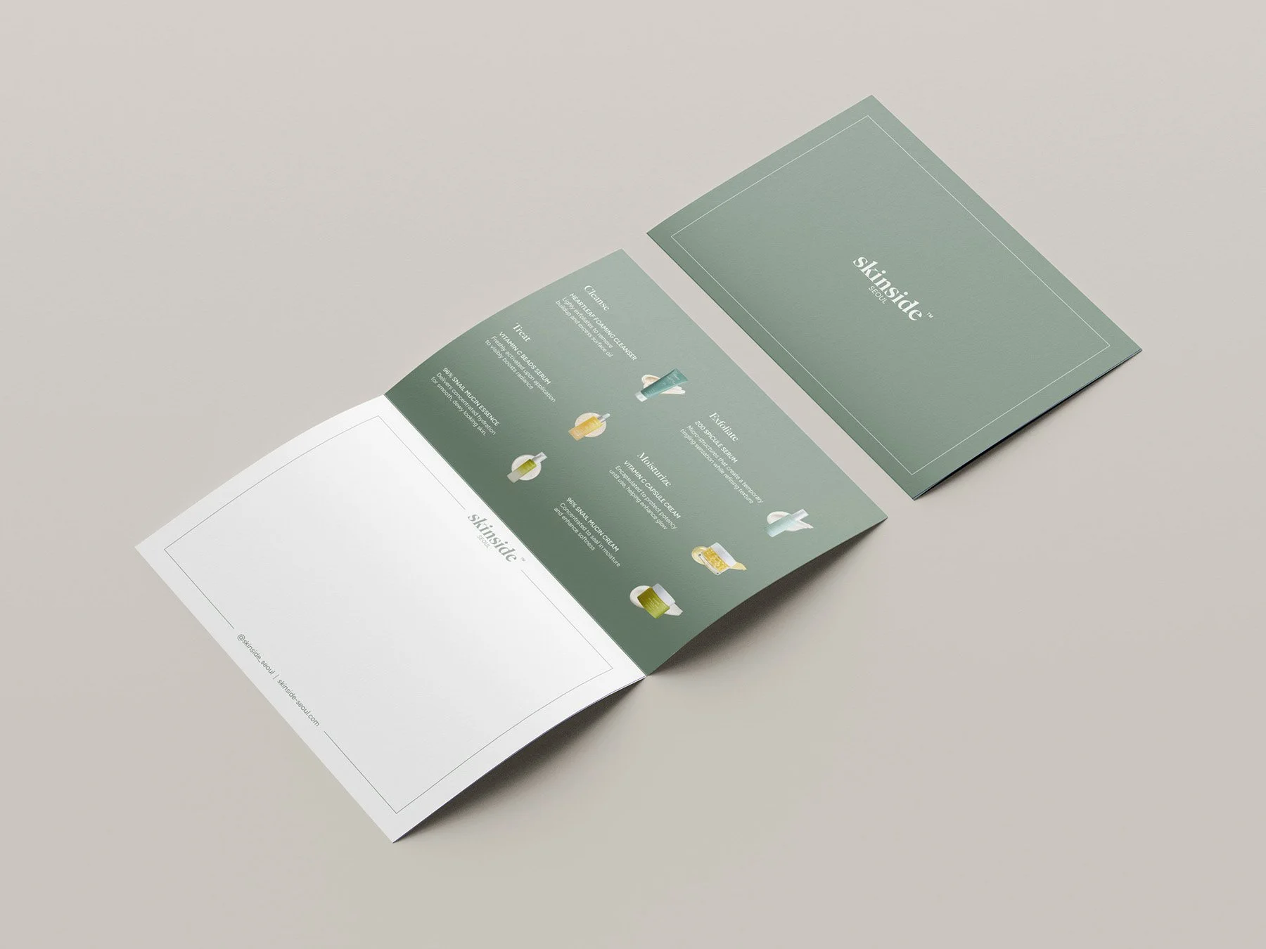
The final box was designed to accommodate the full product line. A muted green color was chosen to reinforce Skinside’s calm, minimal approach to skincare, while the note introduces the products and provides space for a handwritten message.
Sun Care
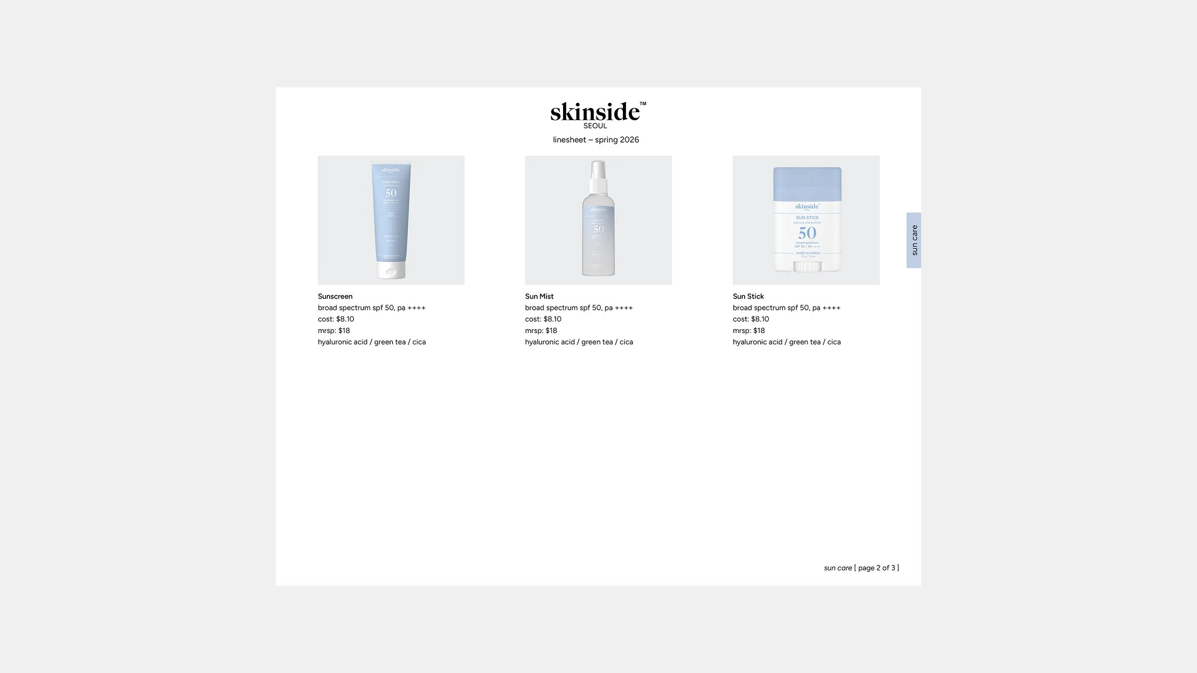
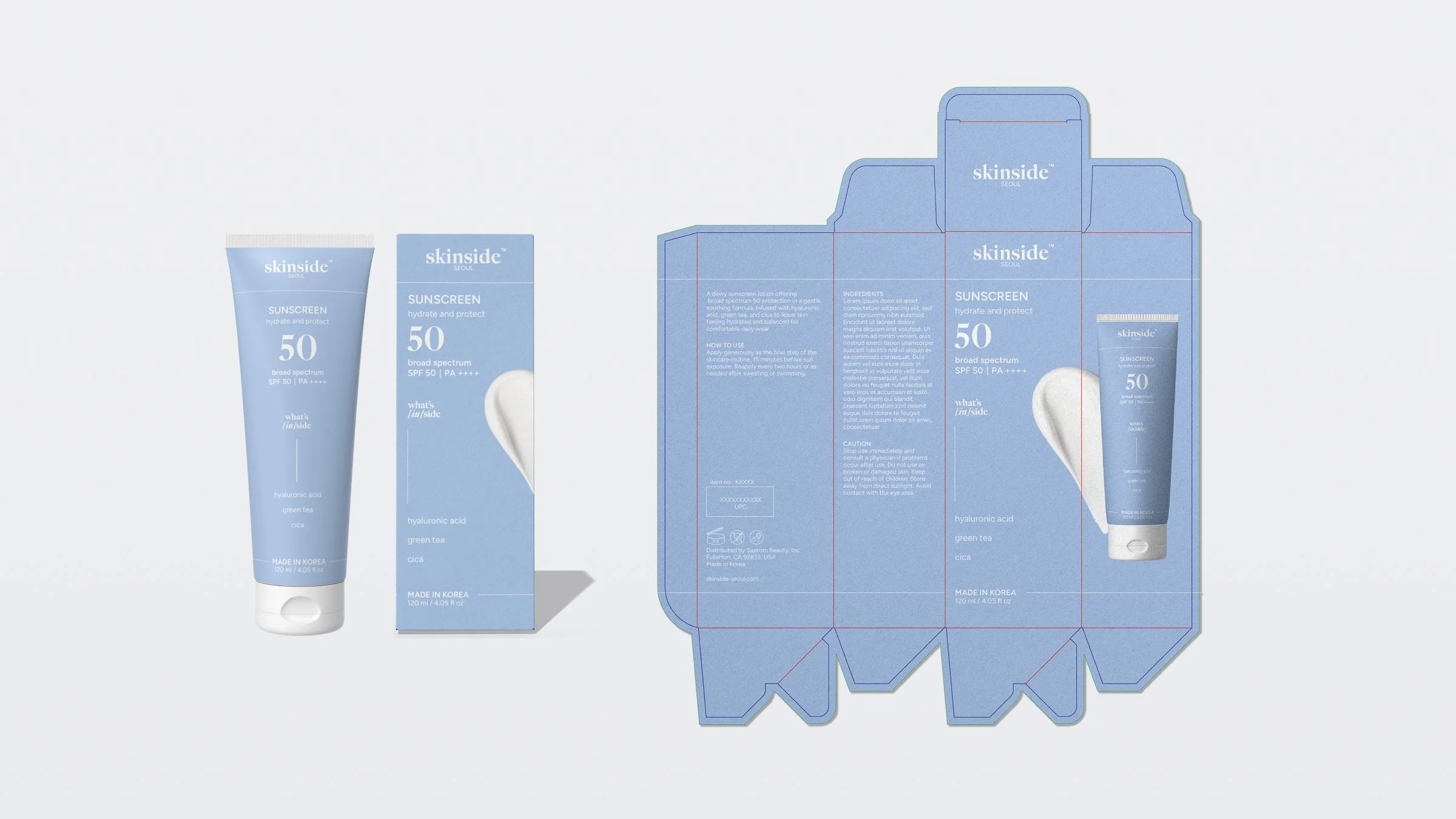
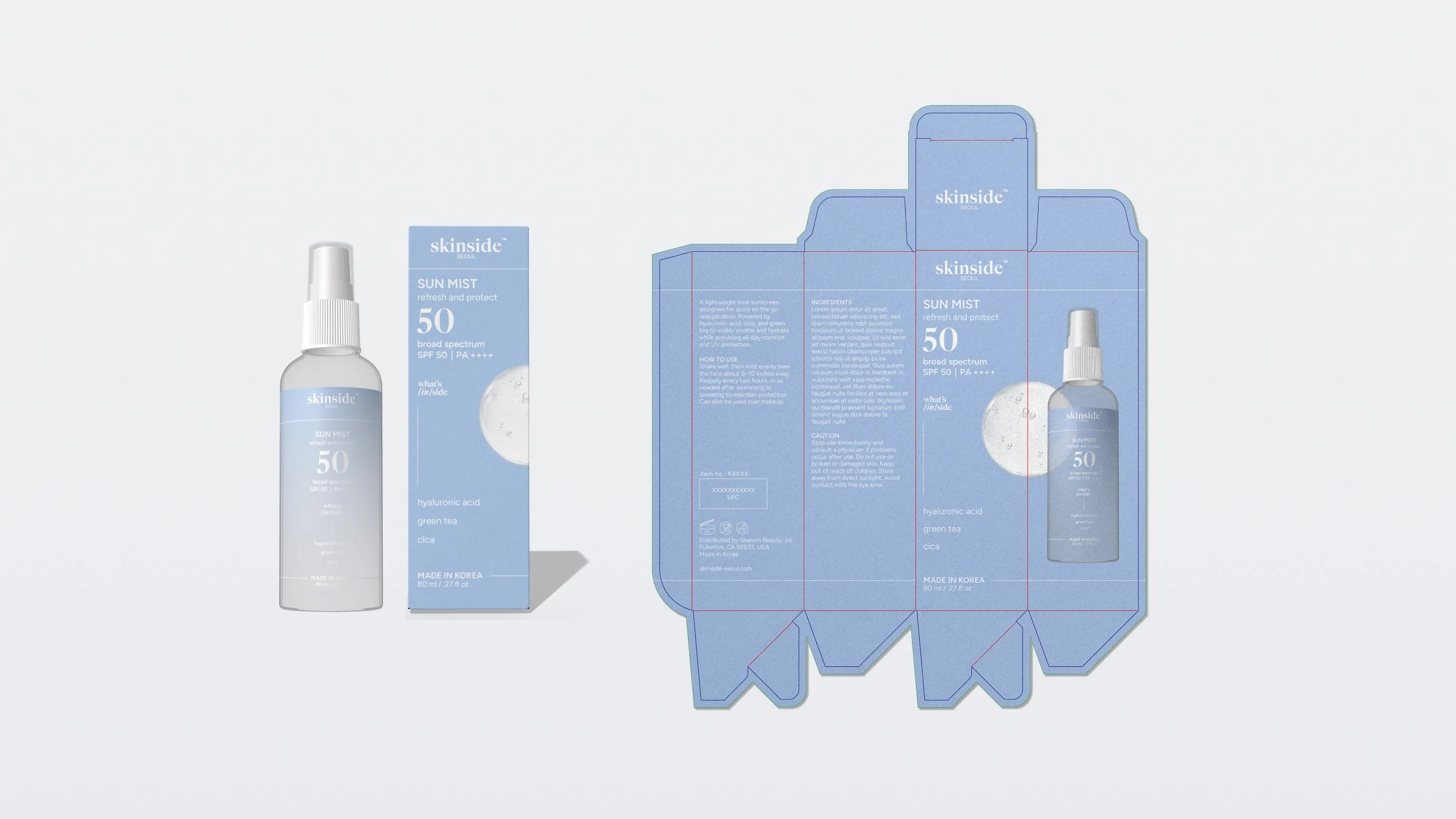
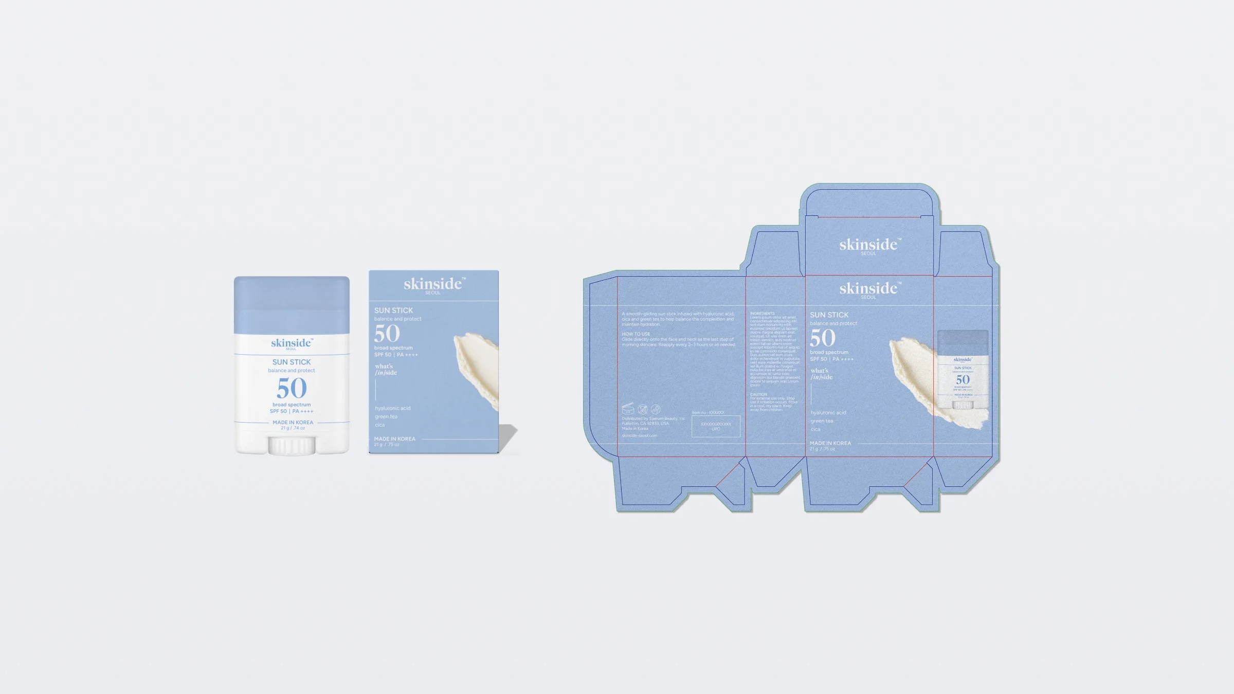
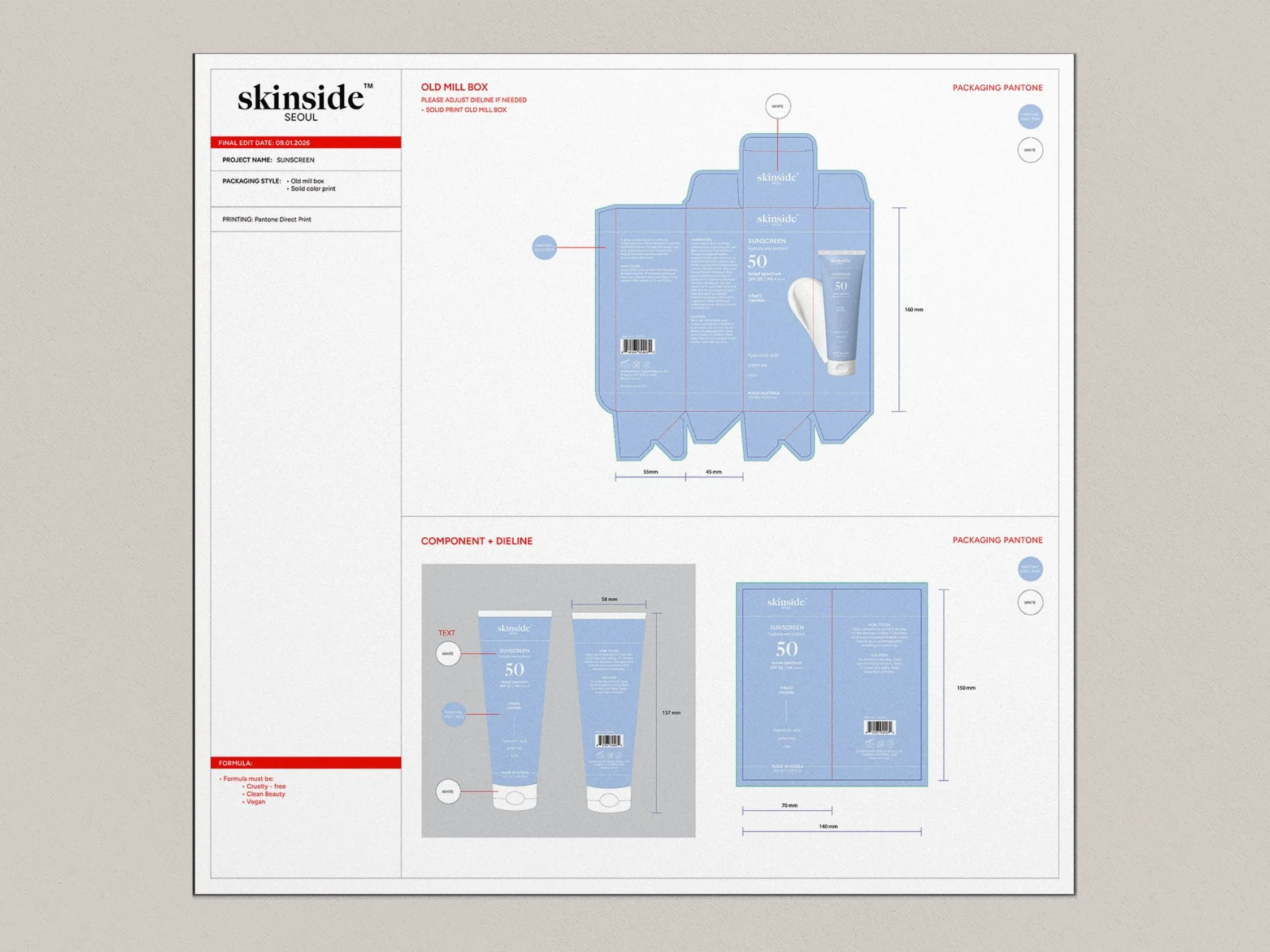
I designed the sun care line using a calm blue palette and oversized SPF 50 as the main visual element. Each product varies in size and format while maintaining a consistent design.
Email Flows
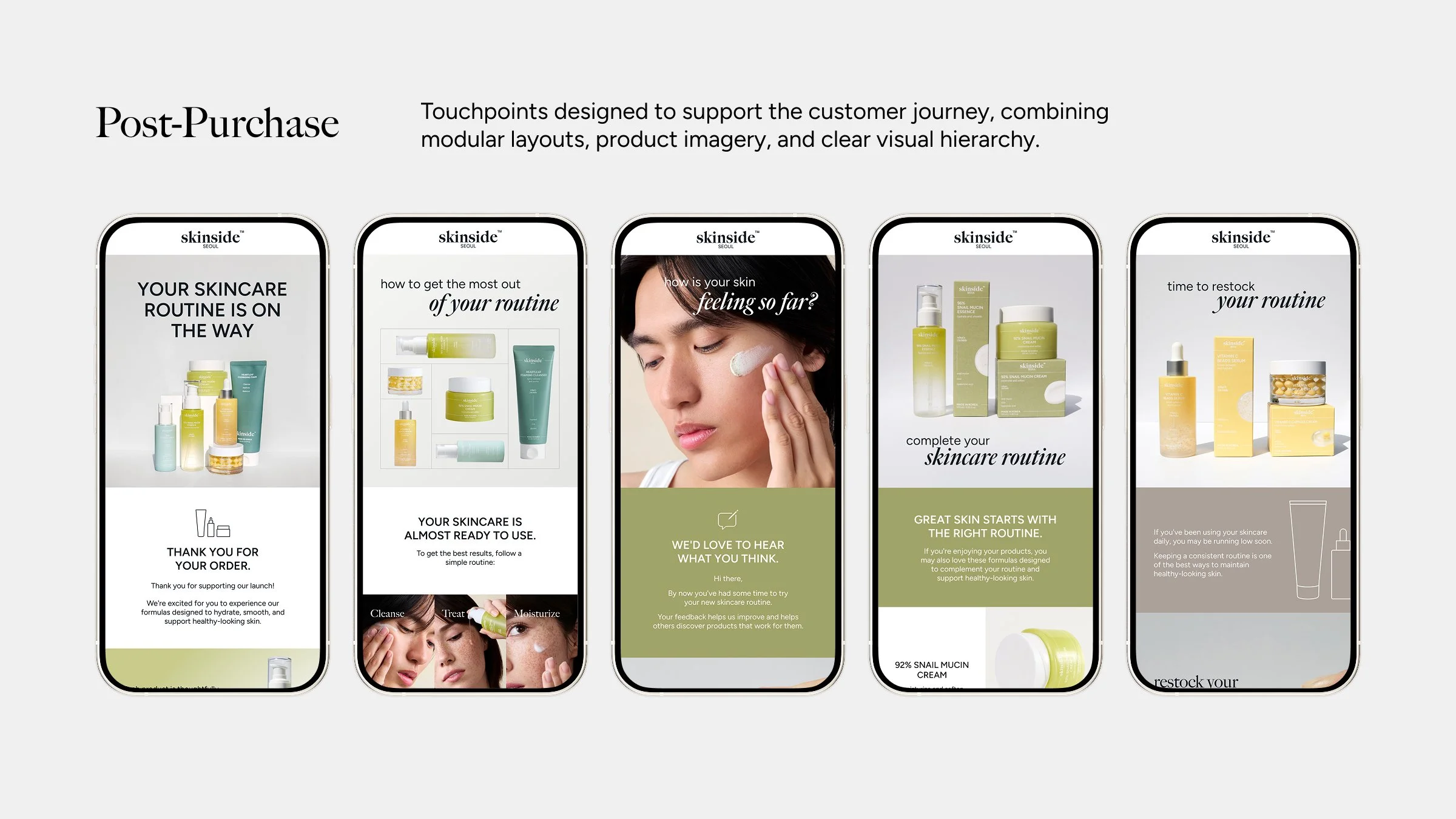
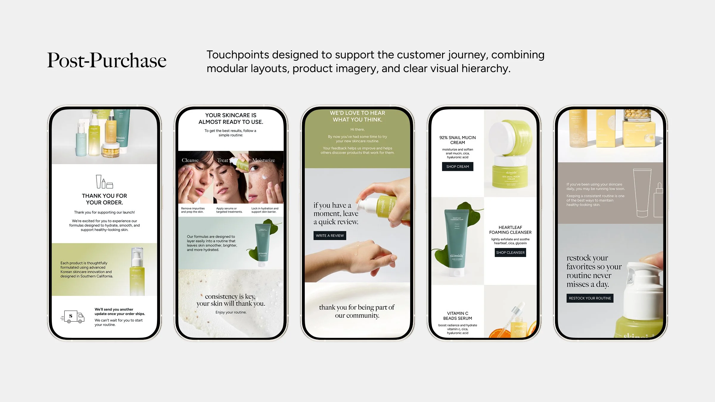
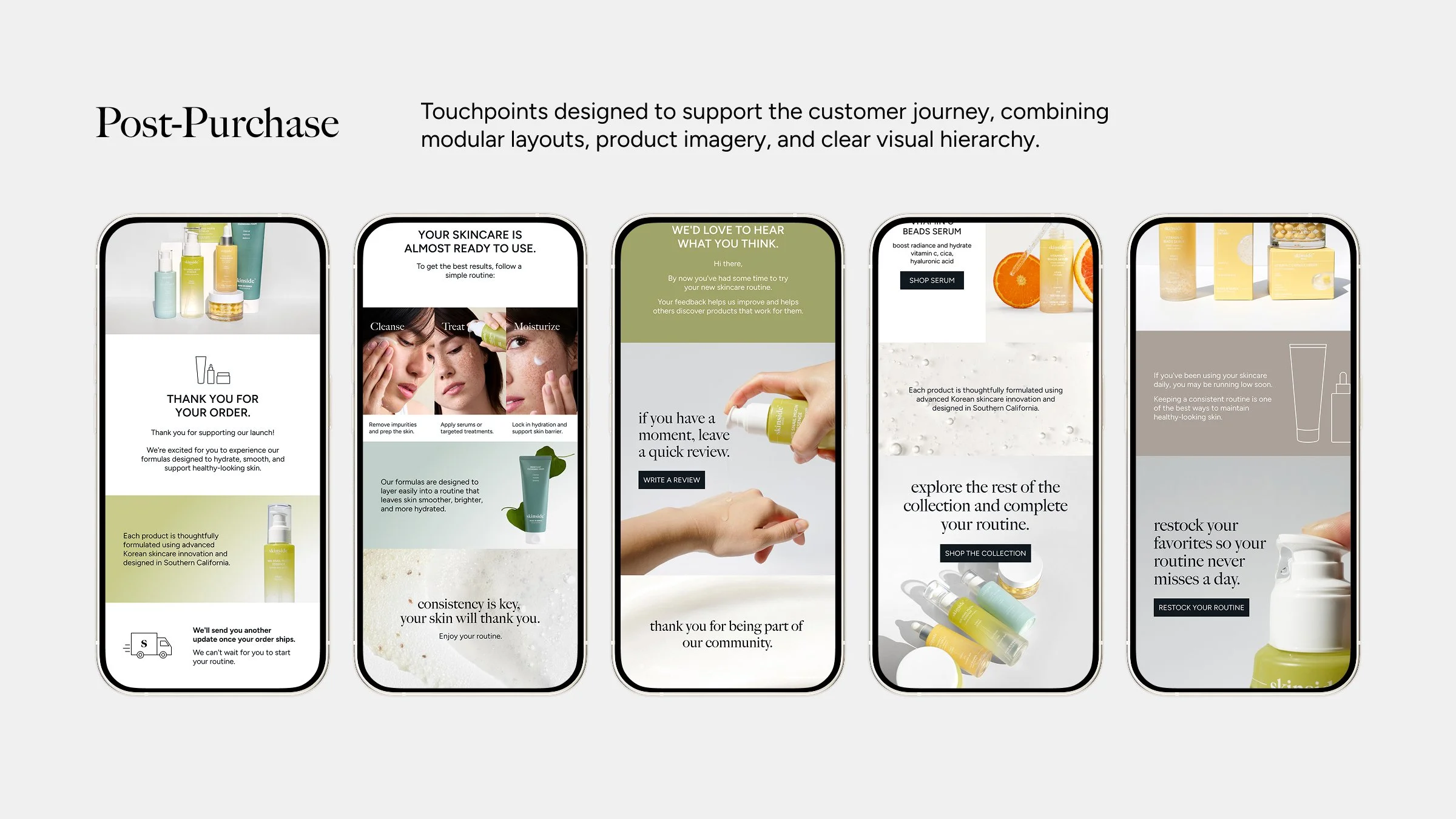
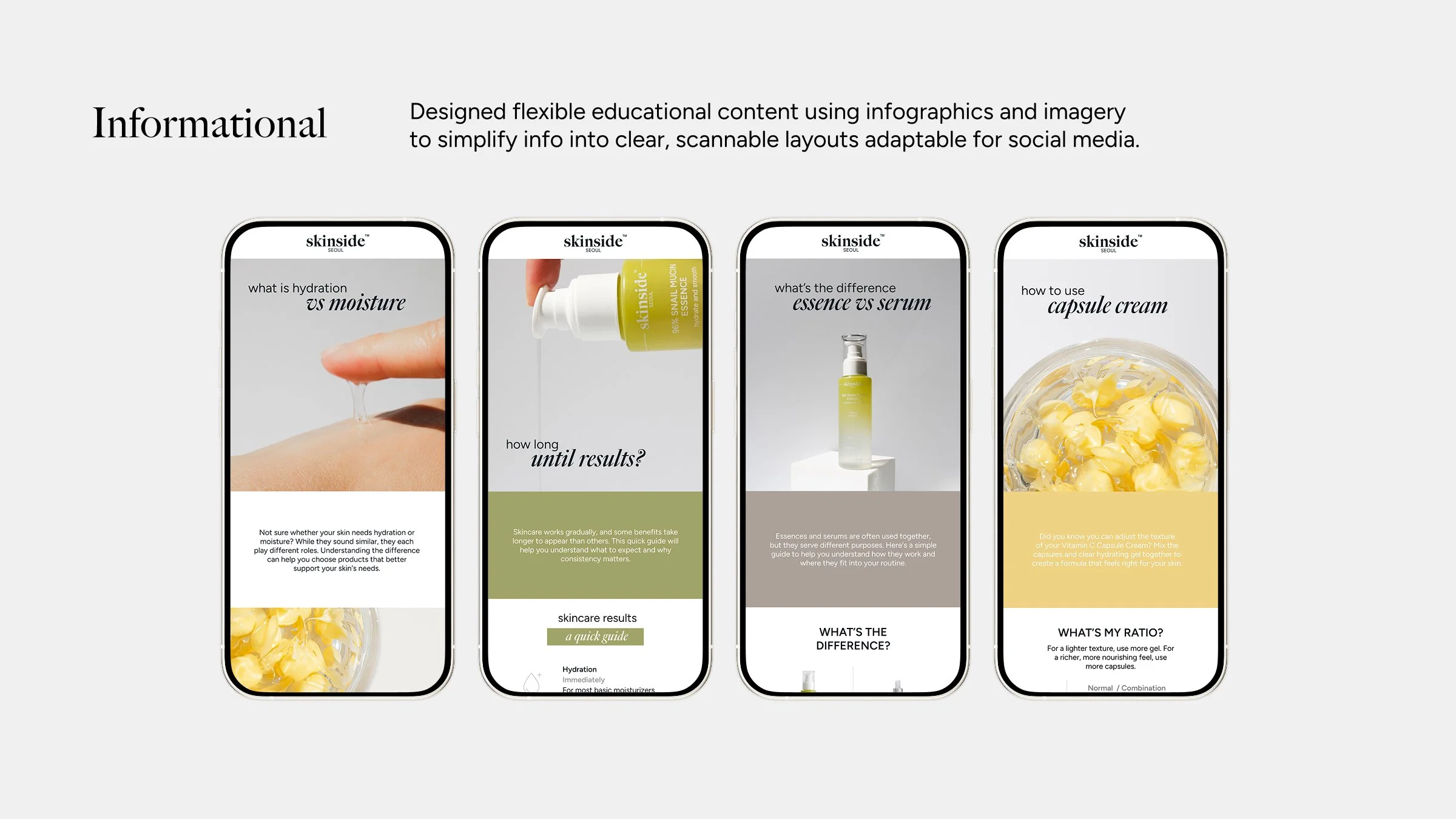
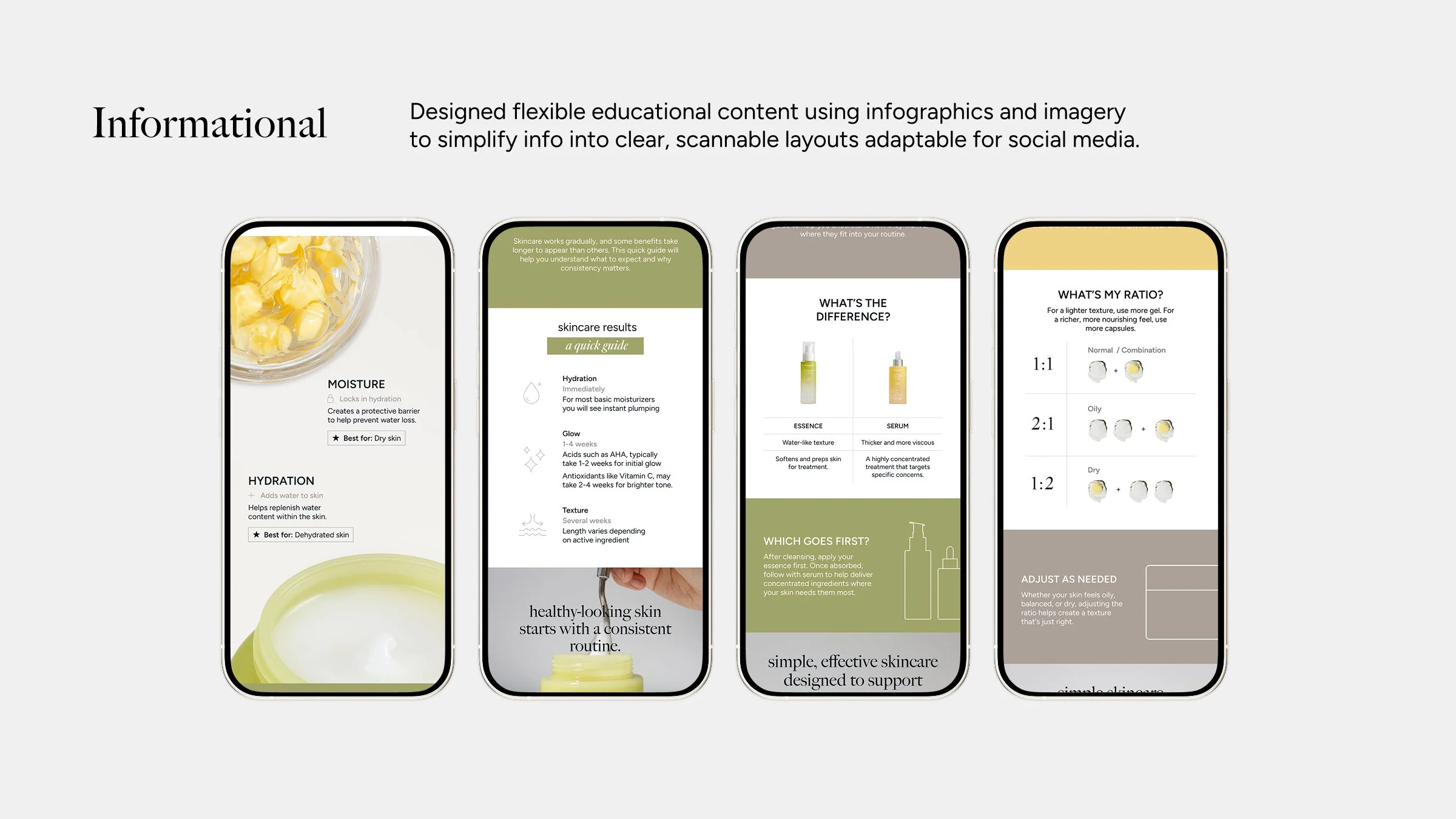
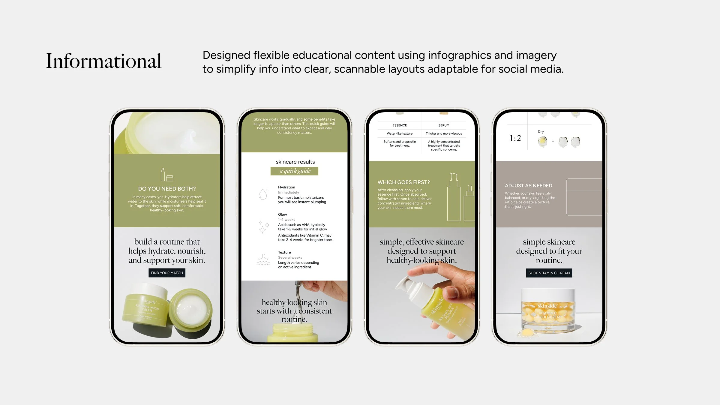
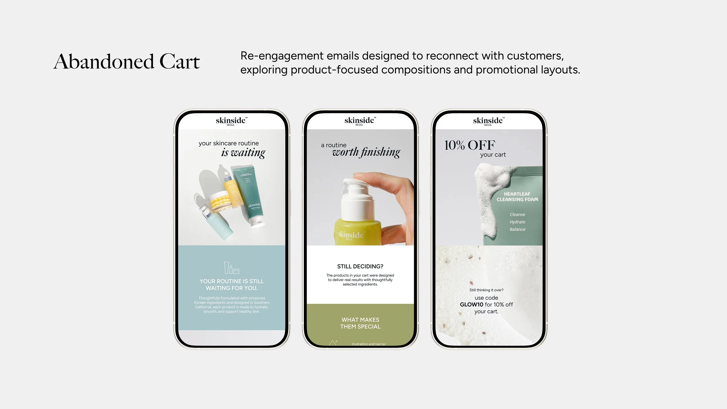
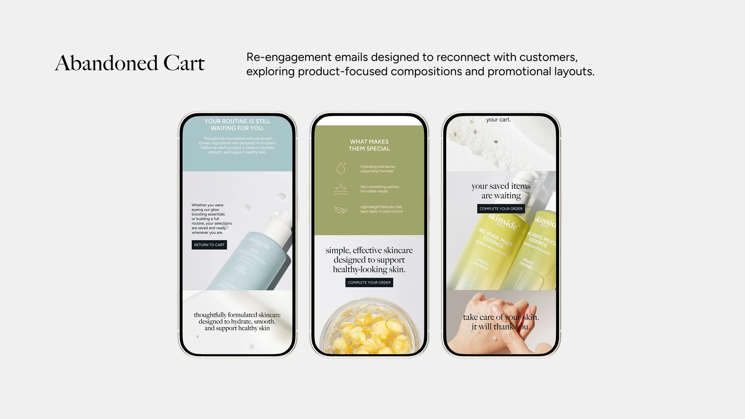
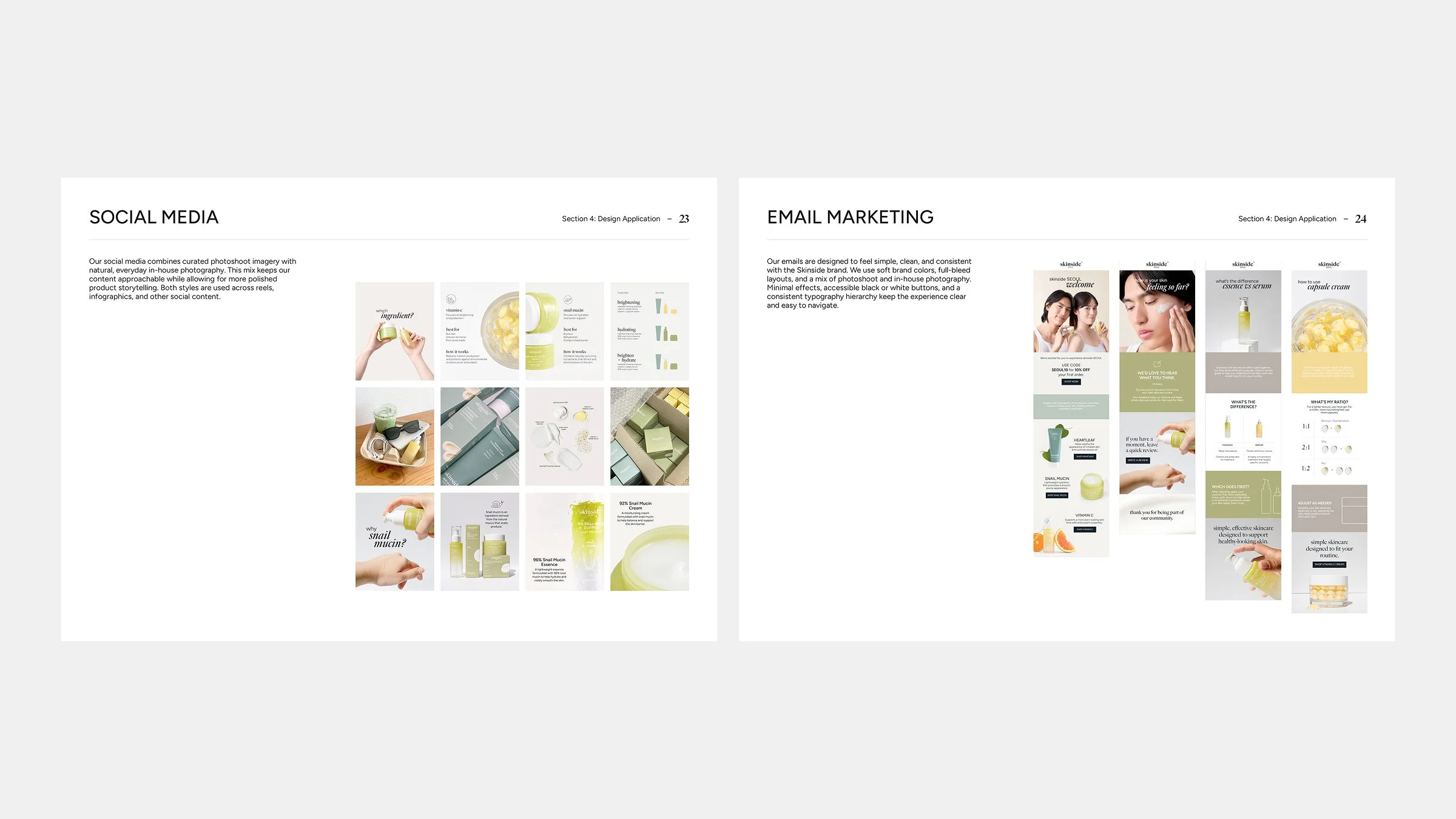
I designed a series of emails for different stages of the customer journey while maintaining a simple, consistent visual style. I also developed infographics to make educational content easy to understand and adapt across social media.
Brand Guidelines
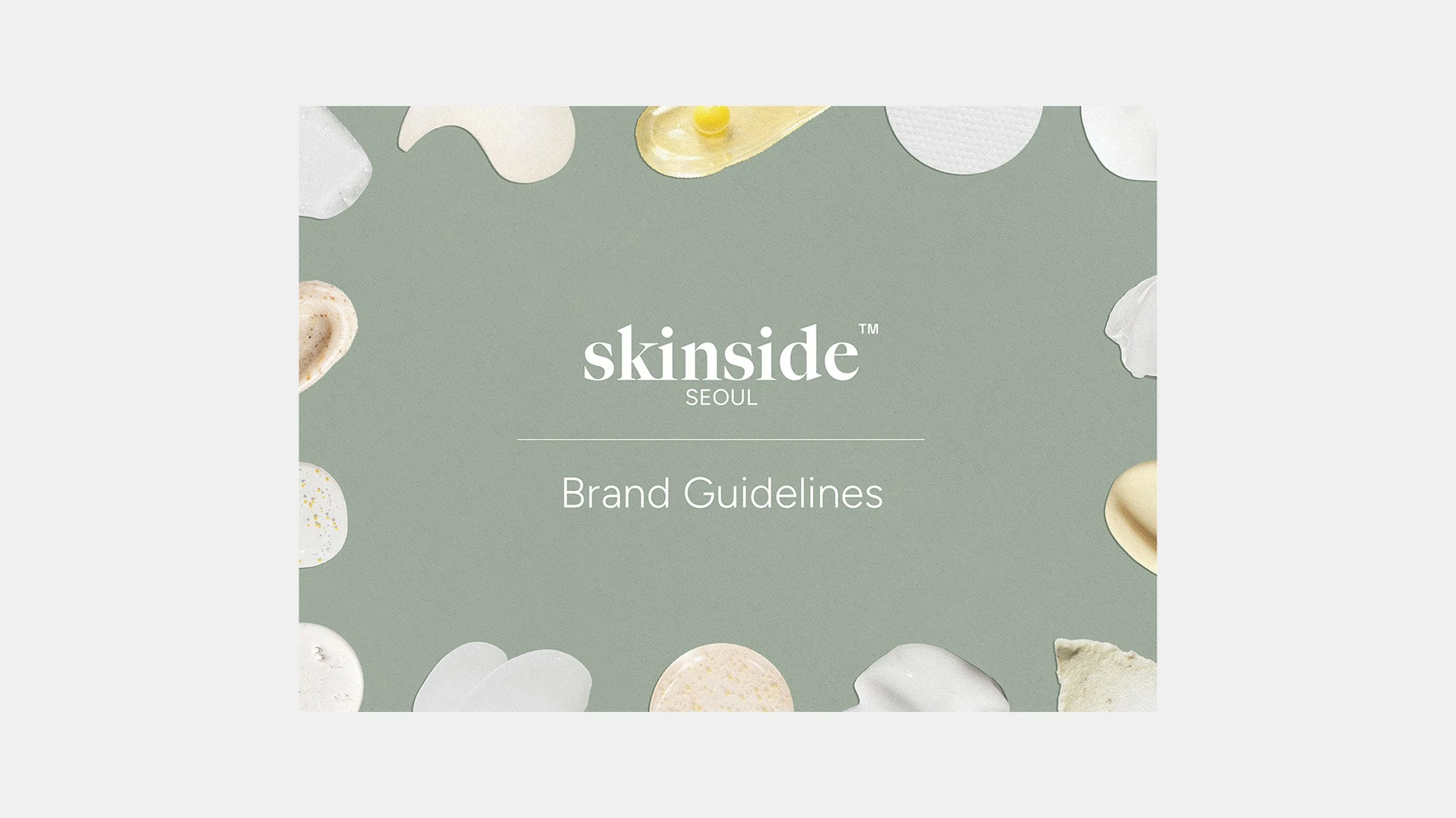
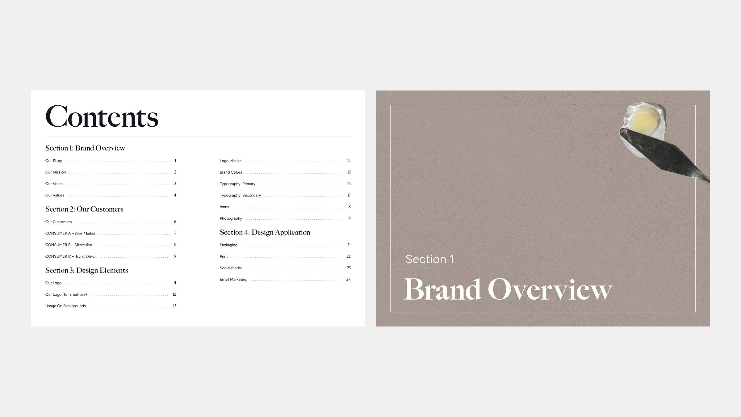
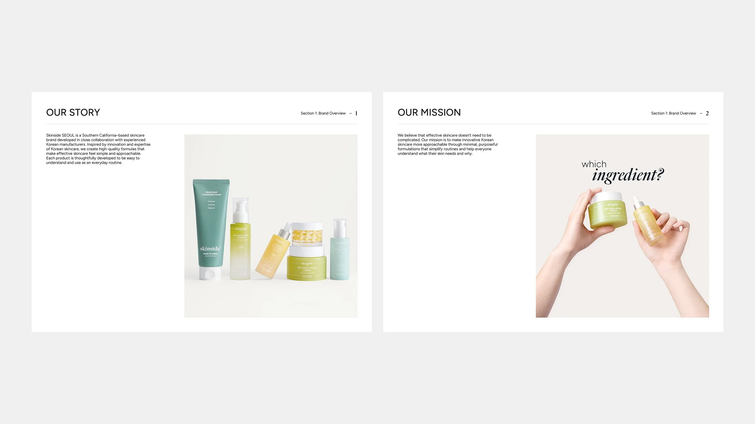
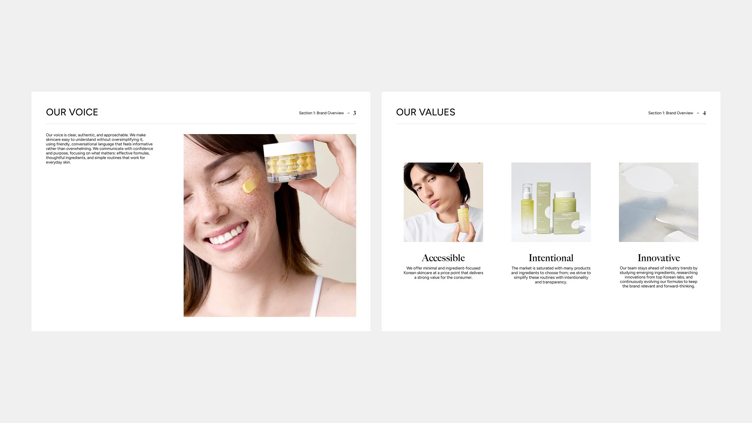
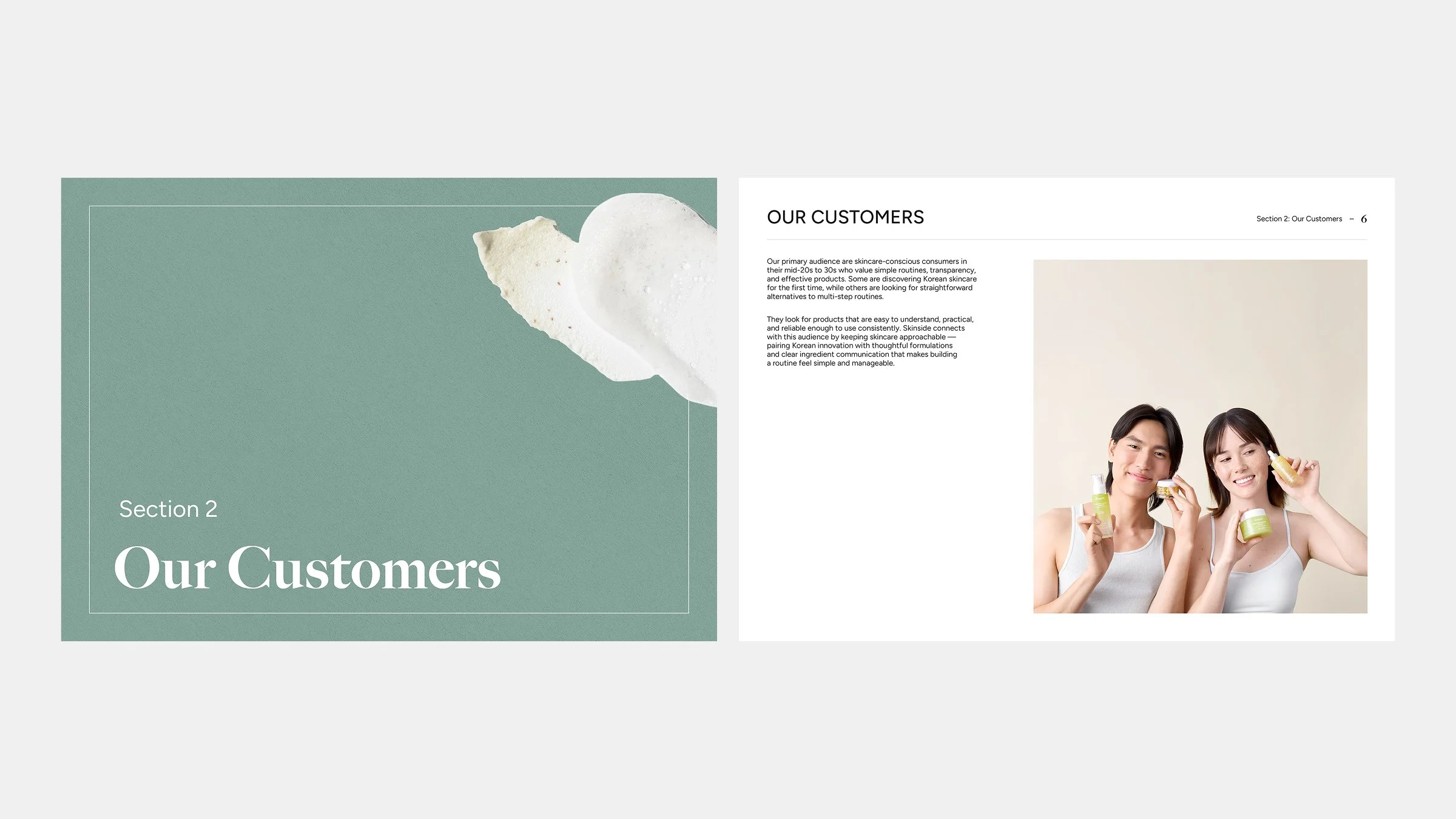
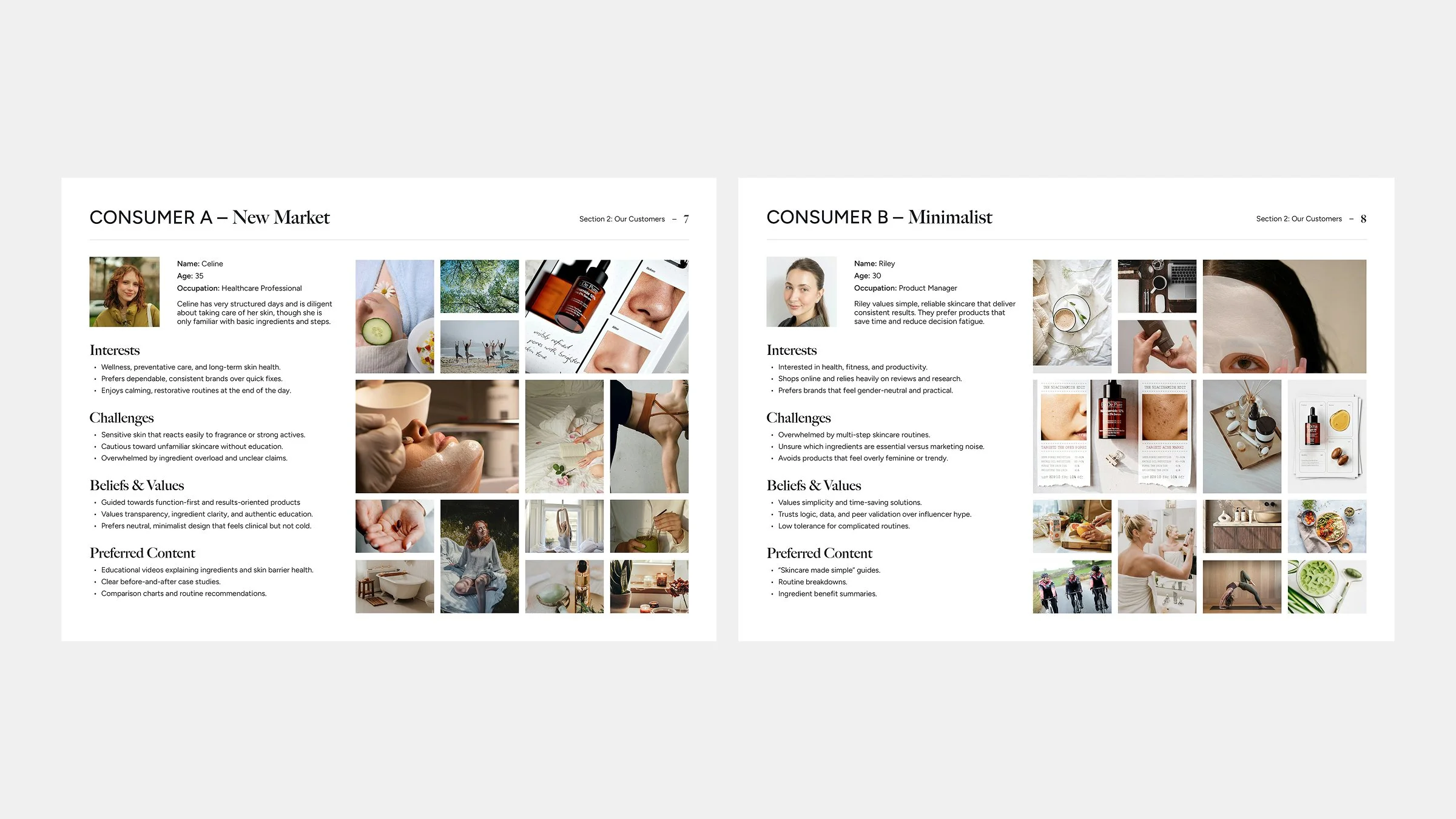
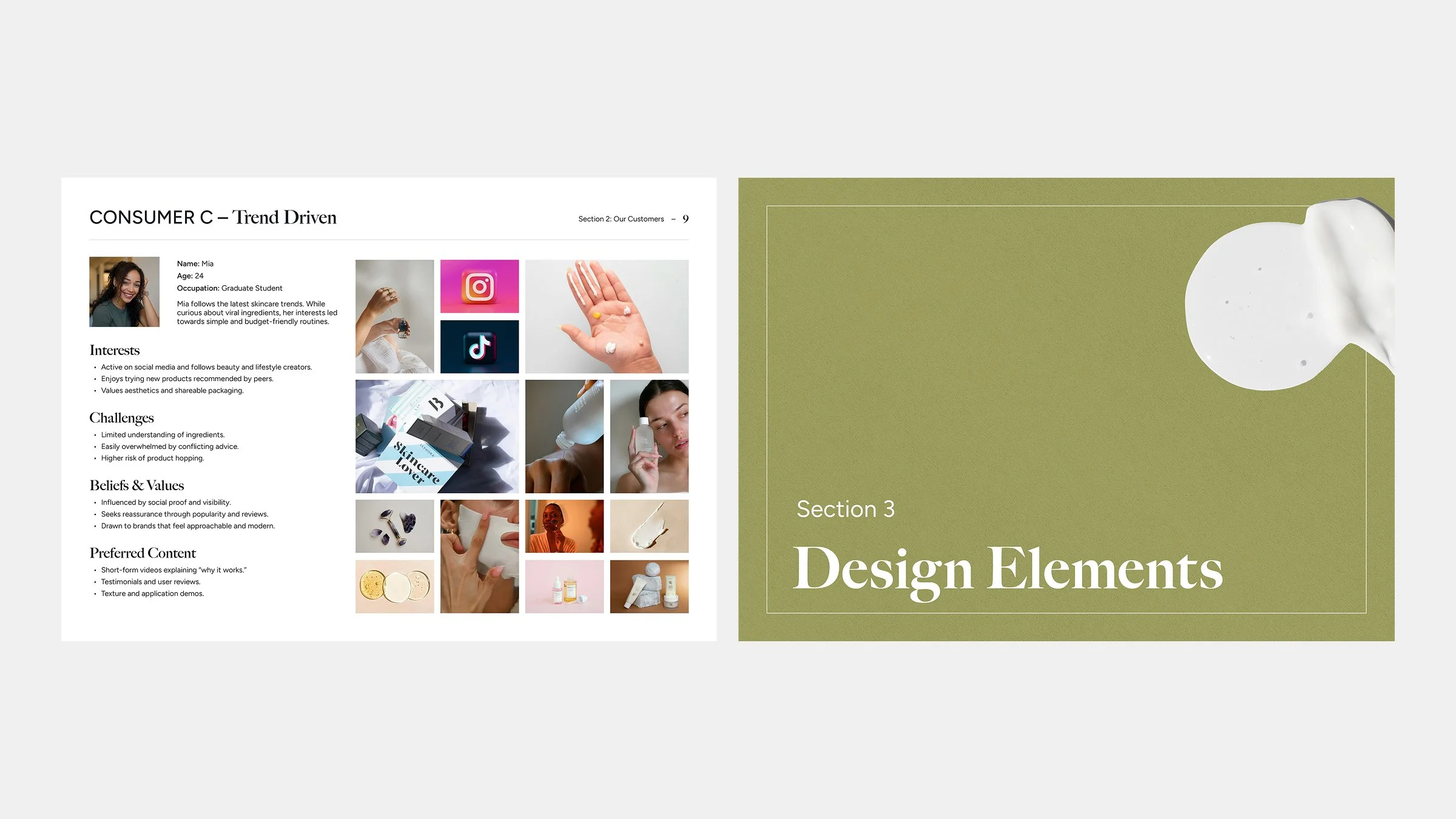
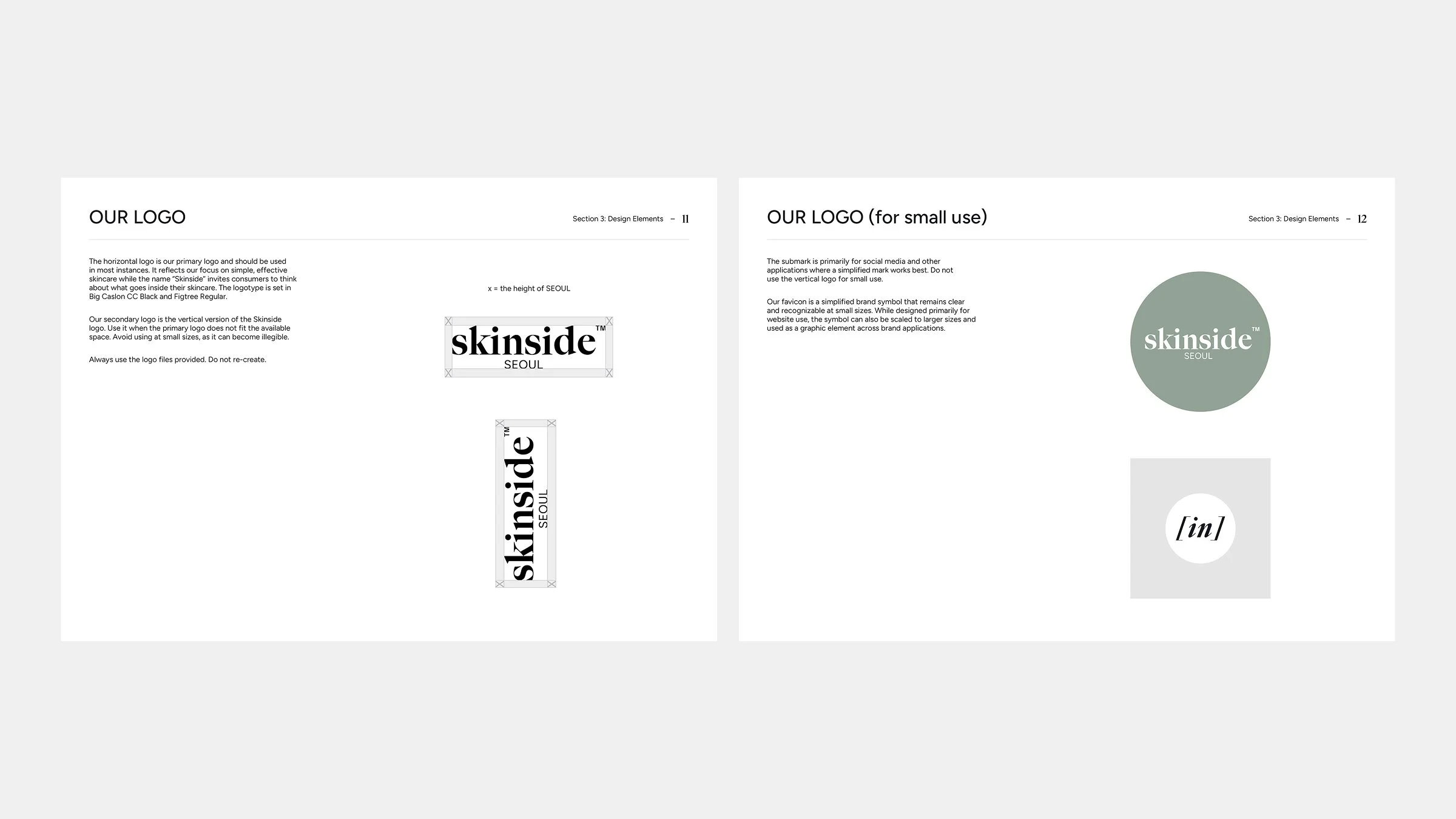
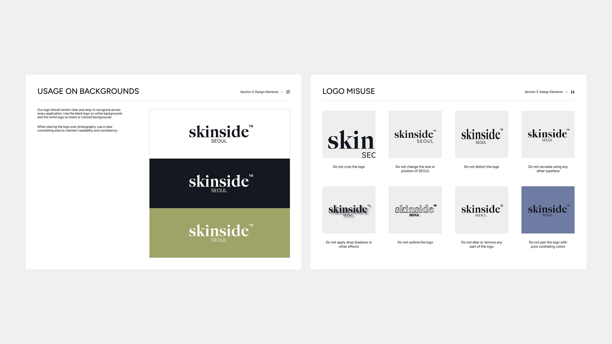
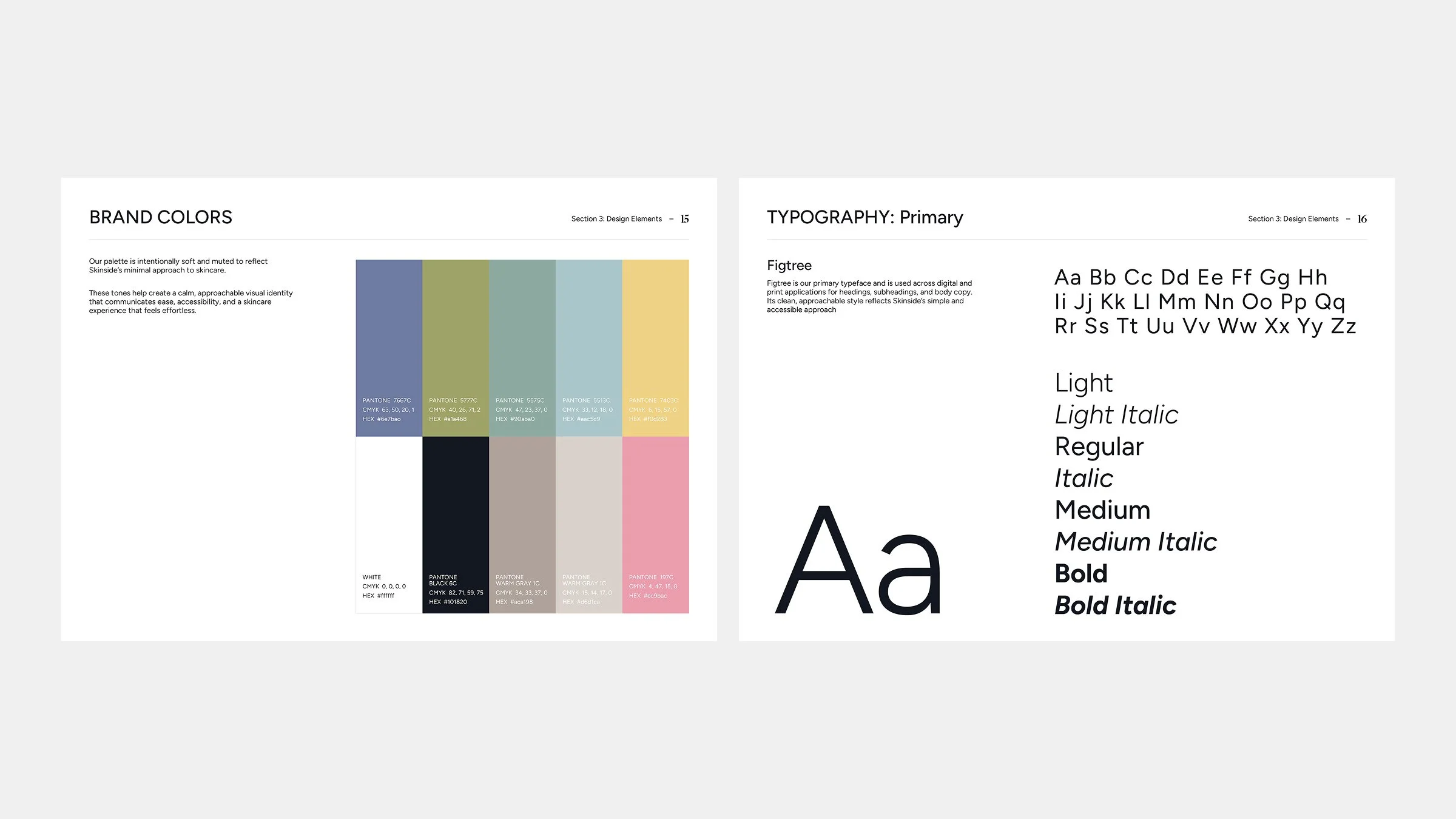
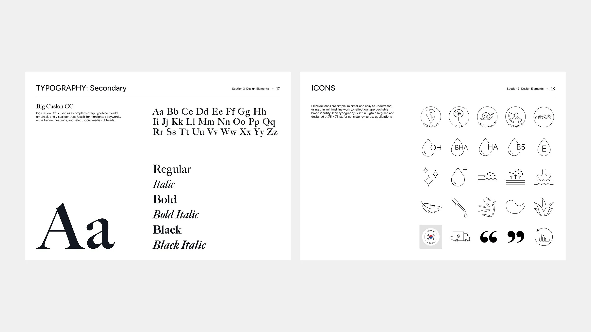
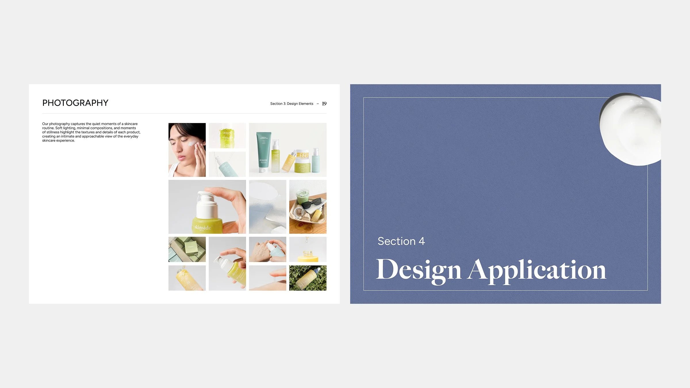
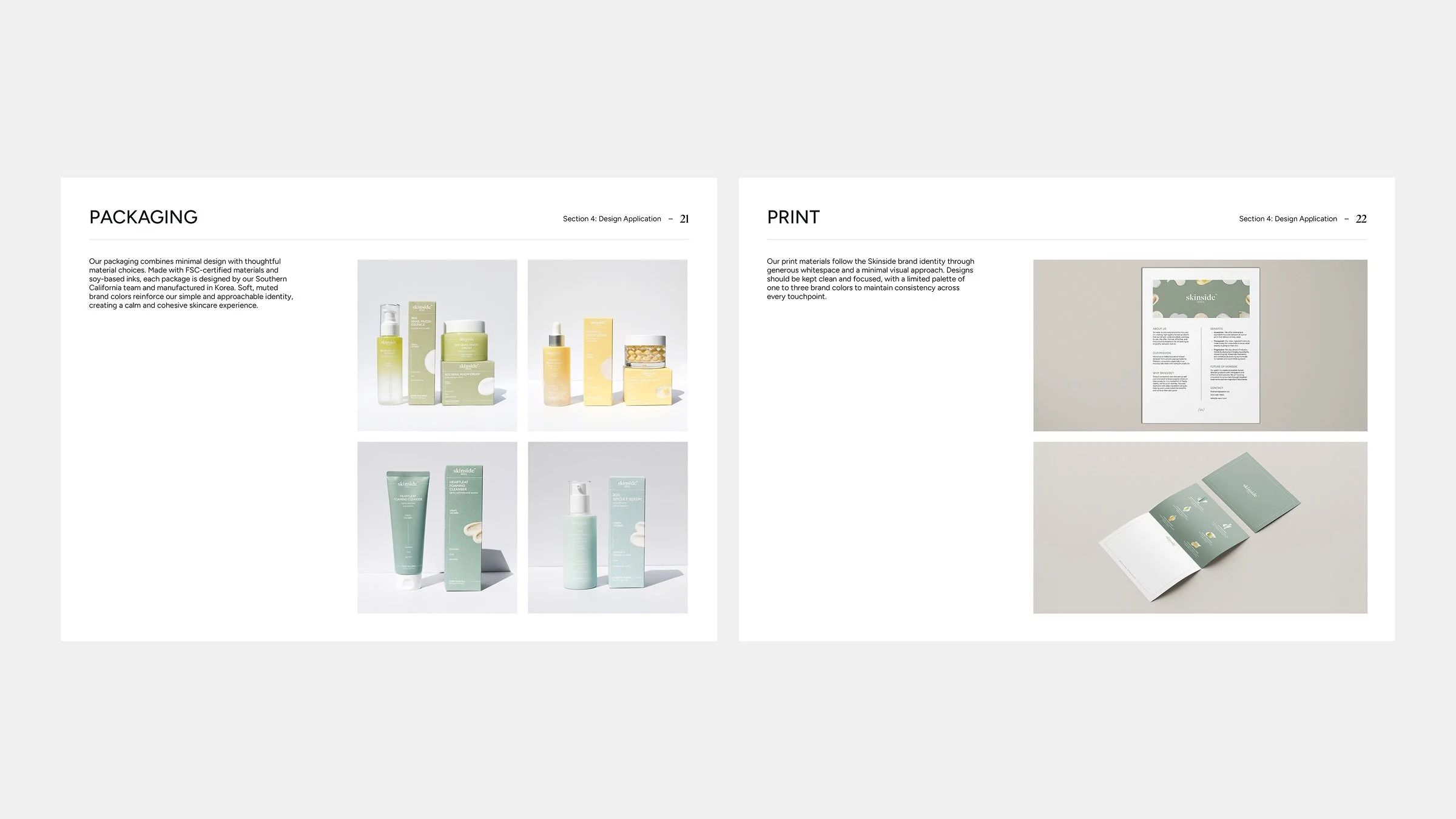
I created a four-section brand guide covering the brand, customers, design elements, and applications as a central reference for maintaining a consistent visual identity.
Line Sheet
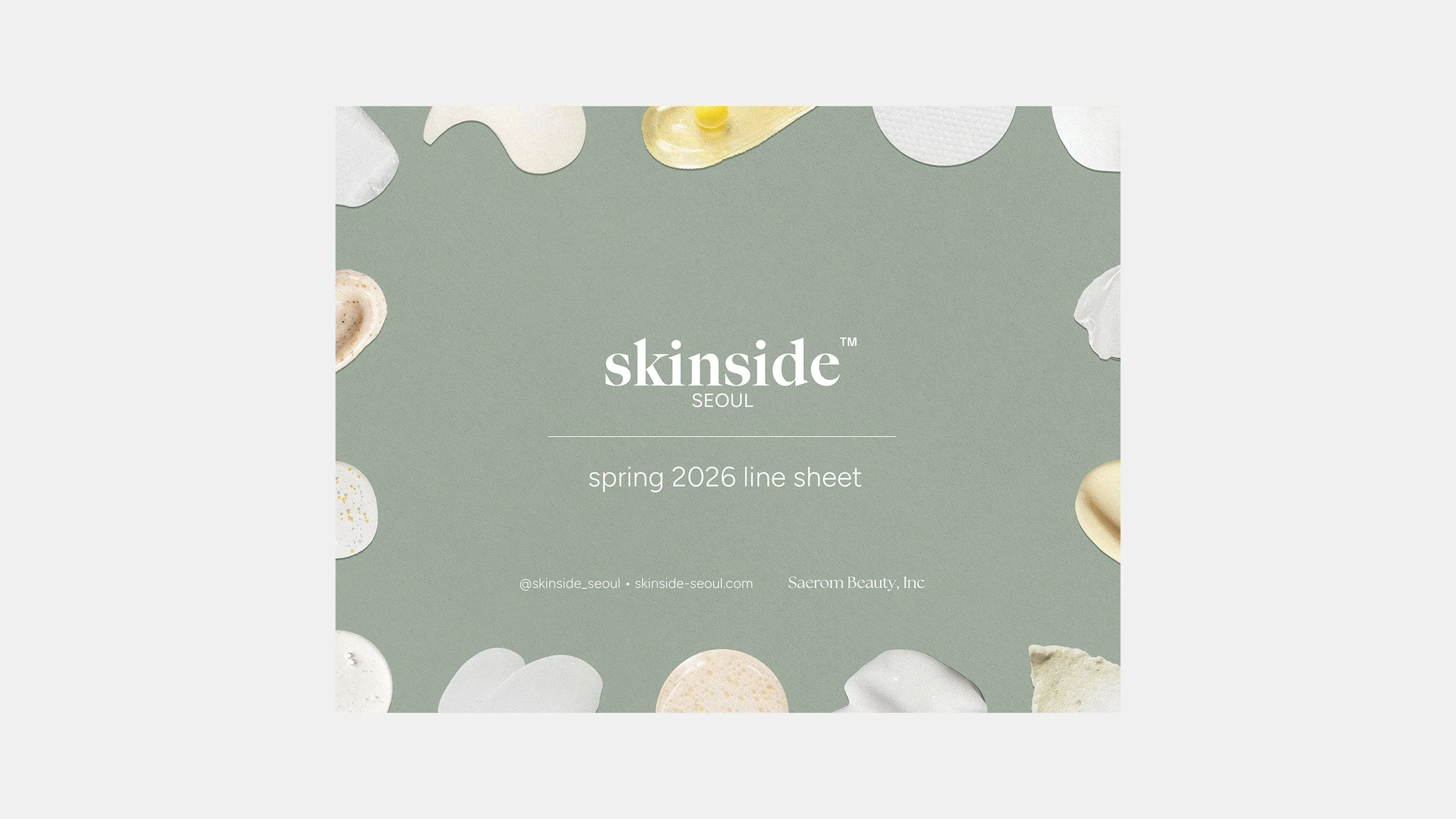
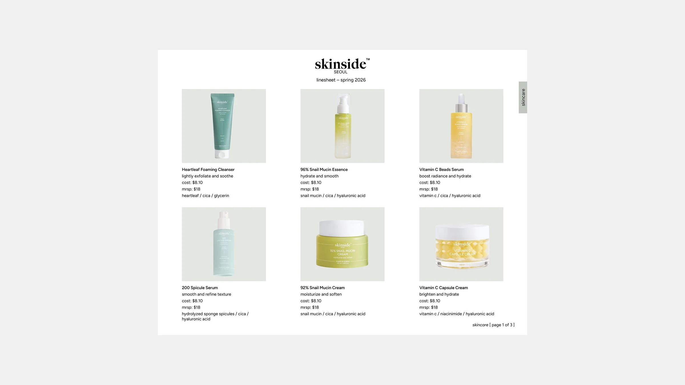
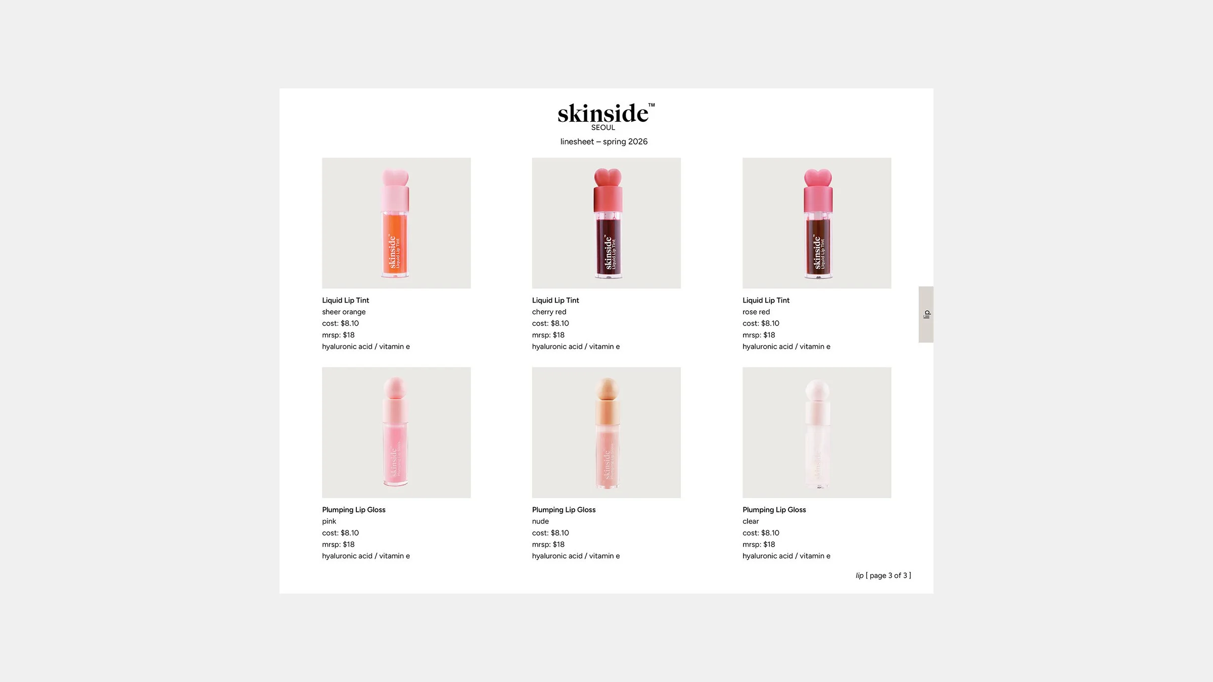
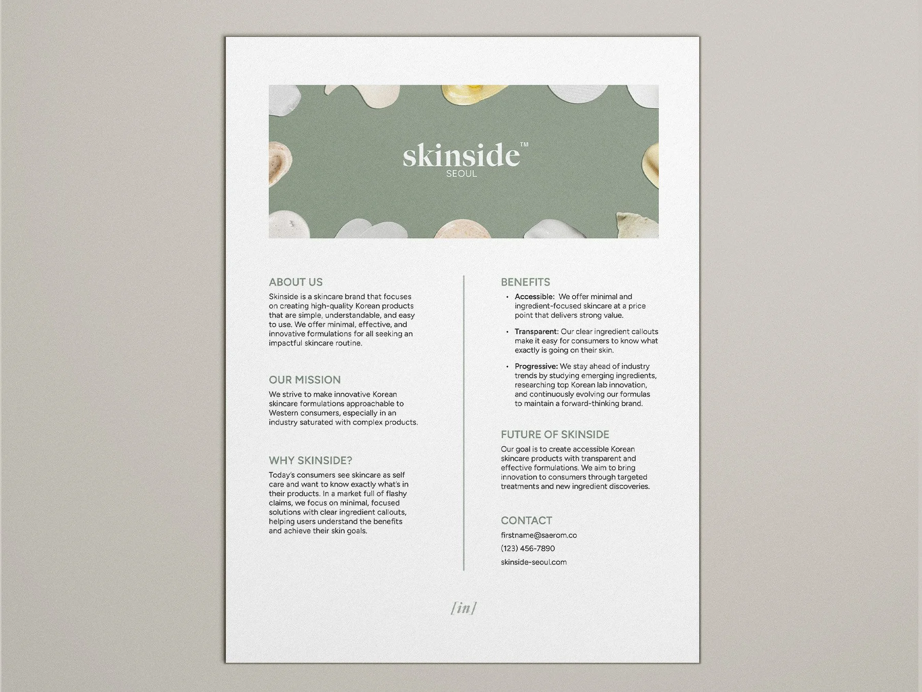
I created a product line sheet for buyers featuring product imagery, key information, and pricing in a clear, easy-to-reference format.